FitRivals
Where fitness meets friendly rivalry
FitRivals is a social fitness app that turns working out into a team-based challenge.
Compete in weekly and monthly challenges, earn points to redeem for rewards, and stay motivated through friendly rivalry.


Timeline
June — July 2025
Role
Springboard Project
UX/UI Designer
The Prompt
A health tracking app for family and friends, available on iOS and Android, was launched three years ago. It allows group members to view each other’s fitness progress.
The company now wants to add a messaging feature to the app.
The Goal
Create the opportunity for users to alert or message each other with health and fitness goals/achievements
Create an integrated messaging experience throughout the product drives engagement and repeat usage
My Solution
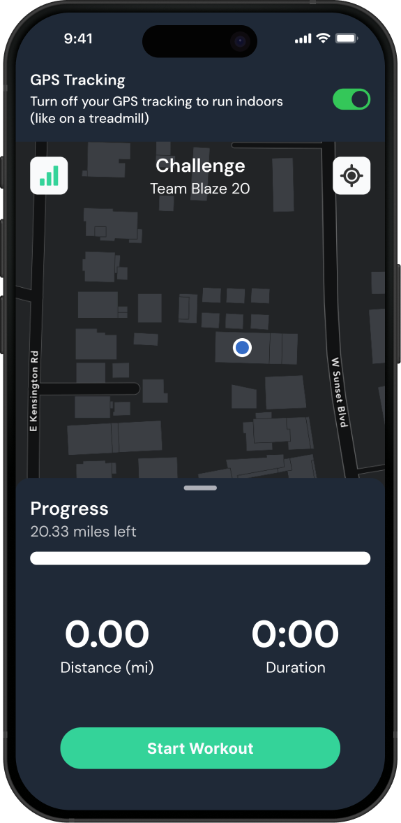
My solution was to design a group-based challenge feature that boosts engagement through community-driven fitness, while still supporting personalized goals and individual fitness tracking.

Group Interaction & Leaderboard
Within each group, members can chat and react, view a shared leaderboard, and track each other’s progress.
Leaderboards are based on metrics such as each member’s challenge activity and completion. Users can compete for ranks and earn bonus rewards for their performance.
There is no direct messaging feature, but users can create a group and invite a friend or family member.
This group can function as a private space for two-person communication and competition, since the feature is designed with group interactions in mind.

Tagging Friends
They can also tag others to send notifications and help keep each other accountable toward fitness goals.
Others can show support by liking and commenting on updates.
Competitive App Comparison
Workout Group & Challenges
Users can create workout groups, invite friends or family, and complete challenges together.

Sharing Progress
Users can share their progress and milestones to both the live feed and their workout group.
Past workouts and stats are automatically saved to the user’s history, allowing them to revisit and share at any time.


Shop with Points
To further motivate users, the app rewards points for completing personalized goals or group challenges.
These points can be redeemed for rewards, offering a clear and motivating incentive to stay active and continue using the app.
Rationale
The rationale behind this design was to create a solution that serves multiple purposes.
While many existing apps include standard features like leaderboards, streaks, and challenges, they often focus on individual progress rather than true community engagement. Even when a social or community feature exists, it tends to feel secondary. I aimed to design a more integrated and unique experience that places group interaction and motivation at the core of the app.
Competitive Analysis
I used competitive analysis to study existing fitness apps and identify opportunities for improvement. I found that gamification boosts engagement, while messaging features were often limited. This inspired me to design a more group-focused communication experience without turning the app into a full social platform.
During competitive analysis, I found that:
Many applications offer group features such as forums, posts, and challenges
These features, along with messaging, were not a primary focus in most apps
Community engagement varied across platforms, with some showing limited user activity
When messaging was available, it was often restricted in functionality
While some apps alerted friends to general activities, very few highlighted personal milestones or achievements

Competitive Feature Comparison

User Surveys
To better understand what motivates users, I distributed surveys to people who currently use or have used fitness apps. Key findings are outlined below:

Information Architecture
After conducting gamestorming sessions informed by competitive analysis and user surveys, I developed this information architecture for my project.

Usability Testing
After developing my mid-fidelity wireframes, I conducted two rounds of usability testing with users who work out and have experience using fitness apps. The major issues identified were related to group features and progress sharing.
Business Benefits
Engagement Drives Retention and Revenue
Because I designed the app to focus on group engagement while users pursue their personal fitness goals, retention rates will be boosted. Higher engagement leads to more consistent app usage, which increases opportunities for revenue through subscriptions, in-app purchases, and brand partnerships.
Reward-Driven Monetization Strategy
By integrating a points and rewards system, I can create new revenue opportunities through exclusive perks and branded incentives (as shown in the current design). This approach not only boosts user motivation but also paves the way for sponsorships and strategic collaborations with fitness and lifestyle brands.
Learning Outcomes
Aligning Feedback with Fitness
Some participants perceived the app more as a social platform, which influenced their feedback. For example, one user suggested adding a post CTA for the social feed or a general chat feature similar to Instagram DMs. This highlighted the need to narrow the participant pool to those who actively use fitness apps or ask them closed-ended questions for fitness , so feedback remains focused on fitness-related features rather than social ones.
Designing for Clarity
I’ve realized that users may not always understand the purpose of a screen or element—even when there’s text labeling it. Adding a brief supporting message at the top of the screen or within a tooltip can make a big difference. It helps clarify intent, reduces confusion, and makes the overall experience feel more intuitive.
Simplifying Leaderboard
Initially, I designed the leaderboard so that each group member could contribute any amount toward completing a shared challenge (e.g., a 100 push-up challenge). While the goal was to promote participation and accountability, usability testing revealed that the concept was confusing and made the interface more complex. Additionally, this approach allowed some users to rely on others to carry the challenge, making it less fair and undermining group motivation.
Expanding the In-App Shop
I’d like to expand the in-app shop, as it serves as a key driver for repeat usage. Currently, it focuses on goods users can purchase with in-app points, but there's potential to add more engaging and varied offerings. This could include items like exclusive drawings, secret offers, or even meal plans to keep users returning and exploring more of the app’s features.
Issues

Users are expected to create or join multiple groups, but the app only allows one.
Users wanted a way to preview or select groups before entering a chat as it feels very daunting.
The leaderboard feels overly complicated when it depends on each member contributing their own effort to complete a full group challenge.
For example, in a 100 push-up group challenge, members can complete as many push-ups as they choose to help reach the team goal — which can make tracking and fairness inconsistent.

Direct and group messaging felt disconnected and should be linked.
While unlikely, some users may prefer to share posts exclusively within their group rather than publicly.
During testing, the sharing flow did not allow reordering of uploaded photos. This felt unintuitive and limiting from a user experience standpoint.
Weekly and Monthly challenge cards lacked visual emphasis, making them feel less important.
Challenge types should be clearly labeled, as users may overlook the image or creative title.


The Shop is inside the Group tab, but it’s unrelated to social features, which made it feel out of place.


Solution
Users can create or join multiple groups through a floating action button and menu.
Enable message preview for group chats.
Each group will have its own leaderboard, determining ranks by group members challenge activity and completion.
Transform the direct messaging feature into an Alerts button. This serves the same purpose by notifying users when friends achieve milestones, while reinforcing that the app prioritizes fitness first and social features second.

Include additionals screen that lets users choose between sharing with their group or publicly.
Revise the post sharing design to support basic actions like selecting and reordering images.


Final Screens

Increase the card and font sizes and include a short description beneath each card to provide additional context.
Label challenge types clearly so users don’t have to guess from images or titles.
Move the Shop to its own bottom navigation tab to ensure it feels integrated within the app experience.


Try the prototype
For the best experience, we recommend trying it on your smartphone to simulate real app usage.