
Find the best locations to take a photo, anywhere
GramCity is a photo editing app that helps users easily make their photos look awesome before sharing on instagram or other social media networks.
It now aims to help people find the most Instagram-worthy photo spots in any city.


Timeline
1 week design sprint
The Prompt
GramCity is a new startup and wants to explore how (and where) they can help users find photo-ops near them.
Constraints to consider:
It needs to be a feature for the existing app
It needs to help users find physical places and locations
It needs to create an active community of users who find & share their favorite locations
Google Venture (GV) Design Sprint
For this project, I followed a modified GV Design Sprint to address critical business questions through design, prototyping, and user testing. The process unfolded in the following sequence:
Role
Springboard Project
UX/UI Designer
Day 1: Understand
Problem
Travelers often struggle to discover visually appealing or “Instagrammable” spots that match their interests or aesthetic preferences. While location-based apps exist, they often prioritize popular or commercial attractions rather than hidden gems, artistic backdrops, or culturally rich environments tailored to the user’s vibe.
Research Synthesis
Based on provided interview notes, an affinity map was created to identify recurring patterns, including key themes and user pain points.

Through thematic analysis, the findings were synthesized and, alongside the developed personas, translated into HMW statements to inform potential design solutions:
HMW let users choose their preferred photo settings?
HMW help users document and share their photos easily?
HMW show users popular photo spots at a given location?
HMW provide meaningful and relevant photo inspiration?
HMW help users discover photo-worthy spots nearby?
HMW prevents users from being disappointed by a location?
User Mapping
An end-to-end user journey was subsequently outlined to explore and visualize potential solution pathways.
Day 2: Ideate
Lighting Demo
To inform the design of GramCity, lightning demos were conducted to examine how competitors enable users to discover photogenic locations. The analysis focused on key features, user flows, and design elements that enhance visual discovery.


Snapchat’s Snap Map
Allows users to view recent activity and explore nearby locations such as restaurants, stores, and landmarks
Inspired by this, GramCity introduces a photo-focused map showcasing picture-worthy spots—from tourist attractions to murals, scenic views, and hidden gems
Users could filter by category or distance, helping them find ideal photo locations nearby
Tapping on a location would reveal details about the spot, a possible live view, and recent community-submitted photos for inspiration
AllTrails
Further reinforced the concept inspired by Snap Map while sparking additional ideas for GramCity
Features a toggle between a map view and a list layout to explore photo-worthy locations more flexibly
GramCity could add a “Community” tab—a hub for sharing and exploring recent local photos, boosting discovery and engagement, similar to AllTrails
Yelp
Yelp emerged as the ultimate design reference for the feature—though with a stronger focus on photo opportunities
The use of map indicators, tailored filters, and a bottom sheet for location details aligns well with the direction GramCity could follow
This structure supports both discovery and decision-making, making it an ideal model for helping users find and engage with great photo spots
Critical Screens
The next step in the design process involved sketching key screens that illustrate the user flow for choosing a photo spot—covering the screen before, the main selection screen, and the screen that follows.
Day 3: Decide
Storyboards
Lightweight, sketched wireframes were created to visualize the complete user flow in preparation for the next day’s prototype.


Day 4: Prototype
Mid-fidelity prototypes were developed to address the solutions outlined in the HMW statements.
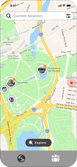
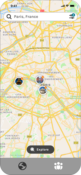
Find Photo Nests
Allows users to search a location to discover popular photo spots in that area
Lets users search for specific attractions they already have in mind
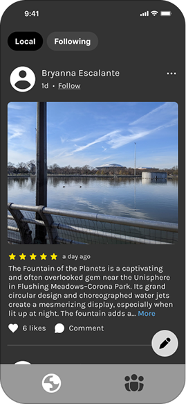
Photo Spot Overview
It includes:
User reviews for each photo spot
Additional images and live views to set accurate
expectionsPhotos taken by the community for creative inspiration


A hybrid approach was used, blending elements from Snap Map, AllTrails, and Yelp to create a map-based experience with toggleable map/list views.
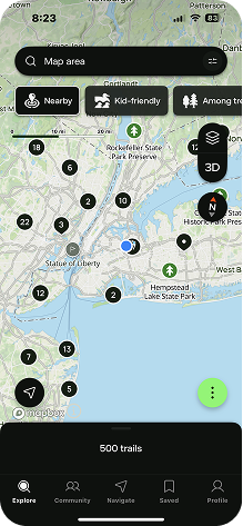
It features:
Visual indicators like pin sizes and icons help users explore nearby photo-op spots and popular locations
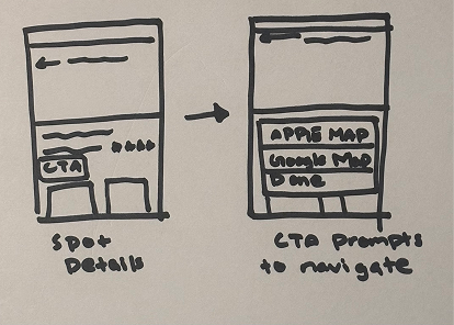
A clear CTA allows users to open directions in Apple or Google Maps, making it easy to visit spots in real life
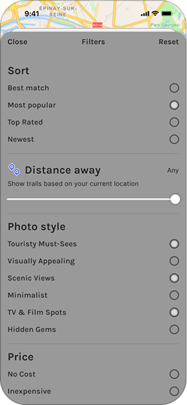
Filters by category or distance, with the default view showing nearby spots
Explore Screen
Allows users to discover nearby photo spots through a gallery view, similar to AllTrails' list view
Inspired by Google Maps' location-based approach to highlighting iconic spots near the user
Day 5: Test
Five remote usability tests were conducted to identify issues and uncover opportunities for improving the design.


Filter By Category
Allows users to choose photo spots based on personal preferences and distance
Highlights popular and hidden locations to support different photo-op styles
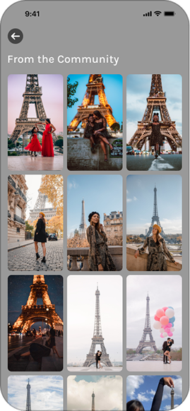
Community Tab
View local content or interact through a friends list
Users can document and share their day, and engage with others through likes and comments
Participants were able to browse and explore photo spots based on their current location
Findings
If the user drags the map to a different area, the “Explore” screen should update to reflect that region
A location pin element would support this interaction by marking the center point and scanning for nearby spots accordingly
Including spot ratings would help users make more informed choices
Issues
The “Explore” button looks and sounds too similar to the search bar, causing user confusion
The “Explore” screen should align with user’s search and filter
Solution
Rename the “Explore” button to “Explore Here”
Redesign the “Explore” screen to reflect the user’s search and filter criteria

Some participants successfully used the filter to narrow their searches
Issues
Few users didn’t notice the Apply button until they scrolled down
Solution
Keep the “Apply” button fixed when scrolling
Final Screens
Based on usability test findings, the design was iterated to align map behavior with user interactions, enhance decision-making through clearer interface elements, and elevate the prototype to high fidelity.


Business Considerations
Photo Spot Discovery as a Premium Feature
Since this was a feature within an existing app, I proposed making the “Find Photo-Worthy Spots” tool part of a Pro subscription. This gives users extra value and encourages upgrades, helping the business earn recurring revenue.
Local Business Partnerships
I explored partnering with photo-worthy spots like murals, parks, and visually appealing cafés as a potential monetization strategy, offering them sponsored placement at the top of the location list to help users discover spots that match their interests.
Learning Outcomes
Iterative User Testing
The sprint involved just one round of user testing. In future projects, I would implement multiple cycles of testing and iteration to continuously refine the design. This would help ensure a more user-informed and polished final outcome.


