HUEY Suncare
Sun Protection for Every Hue of Skin
Everyone deserves equal protection from the sun. Huey is a safe-for-you mineral sunscreen, made for every skin hue, providing everyday nourishment and protection with our trusted formula.

Timeline
July — August 2025

Team and Role
Contract | Internship
UX/UI Designer with 3 peer designers and founder/client
Project Overview
Background
HUEY’s mission is to provide proper education and protection from the sun for all (genders, races, and generations).
They emphasize inclusivity, designing mineral sunscreen for every hue—meaning every skin tone. Justin (The owner) wants to showcase the sunscreen as a tool to prevent sun fatigue.
The Problem
HUEY’s current website lacks educational content around sunscreen and sun fatigue, which makes it hard for users to make informed purchase decisions. It also struggles with usability and trust-building, which limits its potential as a direct-to-consumer platform. On the UI side, issues like inconsistent formatting, a broken “Add to Cart” button, and no visible payment method during checkout further impact the user experience.
The Goal
Redesign the HUEY website to improve information flow, clearly communicate the benefits of HUEY’s sunscreen, and create a seamless UX/UI while enhancing the brand’s digital presence through an updated website and targeted digital marketing.
Competitive Analysis
Eucerin, Black Girl Sunscreen
Eucerin and Black Girl Sunscreen offer quick-read resources to educate and support users
However, the client prefers HUEY’s credibility to stand on its own, without requiring users to read through numerous articles
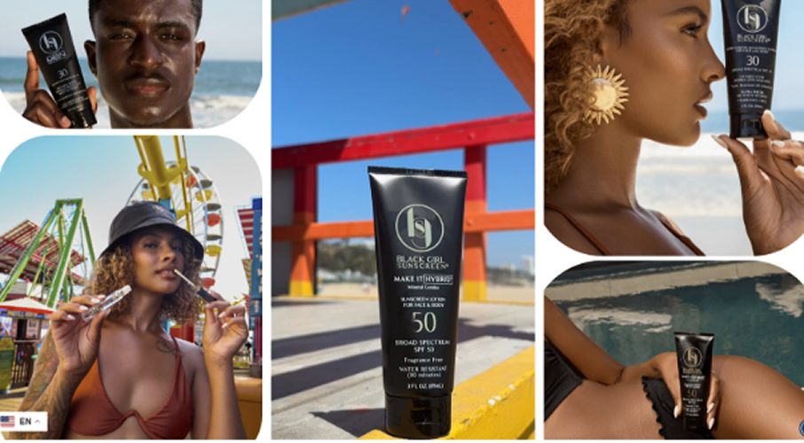
Black Girl Sunscreen
They leverage a strong influencer network and digital presence through engaging visuals and user-generated content, building credibility and strengthening brand identity

Supergoop, Curology
Supergoop and Curology both feature a personalized quiz landing page to guide users toward the right sun protection for their needs
Curology also includes a 'How it Works' section to make the service feel approachable and easy to start
Consider adding a virtual chat with an AI assistant or expert to help users find the right product

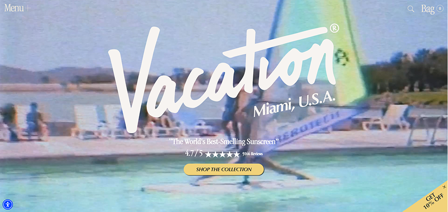
Vacation
Has an aesthetically pleasing, retro, and immersive feel
Hovering over products triggers animations, adding a fun vibe
Features a 'Vibe Generator' that lets users interact as if shopping on a beach
Information Architecture
Based on competitive analysis and client feedback, this became the backbone of the website. It was designed to help users find the right sunscreen while reinforcing the brand through testimonials, product quality, and a touch of social media presence. It also provides concise education on sunscreen benefits and sun fatigue without overwhelming users.

User Flow
Shop-to-Checkout Red Route
For most of the project, I was responsible for developing the shop-to-checkout flow. Additional screens were created collaboratively as we explored different ideas and approaches to meet the client’s goal.

The Redesign
Old

Product names lack hierarchy and have spacing issues
The FIND YOUR HUE buttons are unclear in purpose
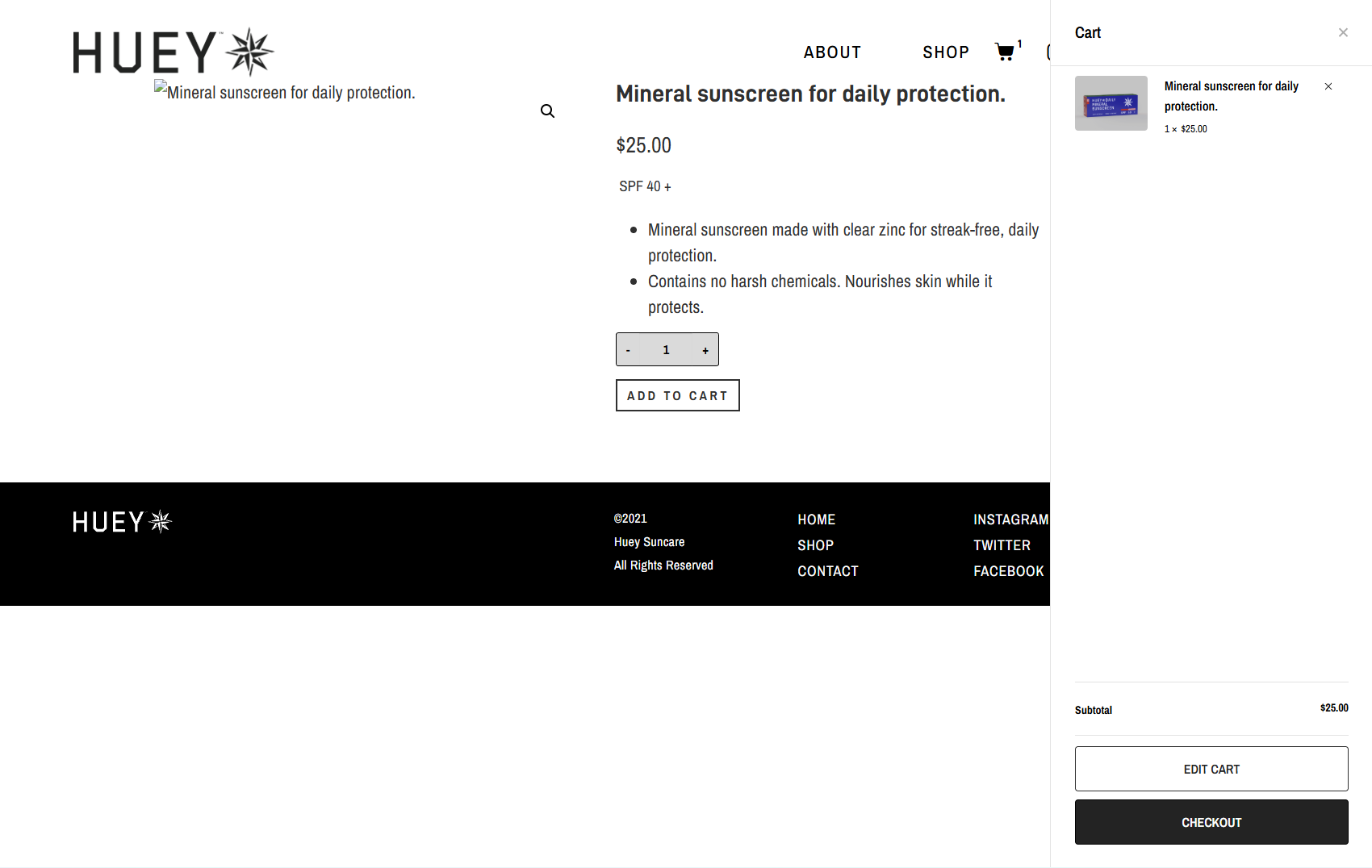
Product Page

Product information is insufficient
The Add to Cart button is non-functional
Related products appear too similar to the main item
Old
EDIT CART button is unnecessary if edits can be made in the cart drawer
Lack of cart drawer editing forces users to a separate screen, creating a pain point
Old

Coupon application should be on the payment screen
CONTINUE SHOPPING button feels out of place and would be better in the cart slider to avoid interrupting checkout flow
Old

CART section does not function when users try to make edits
No option to enter shipping information; system assumes it matches billing
No ability to add a payment method, yet the “Place Order” button appears functional
Coupon code field should be placed near payment information entry


New

Hero section features a graphic to engage users and improve hierarchy
Navigation has distinct shopping tabs for category browsing
Product listings show ratings, prices, and hue types for easy sorting and differentiation
New

Product info now lists benefits and ingredients for informed decisions
Hue options on the product page remove the need to navigate back or search in related products
Add to Cart button functionality has been fixed
Editing in Cart Drawer
New
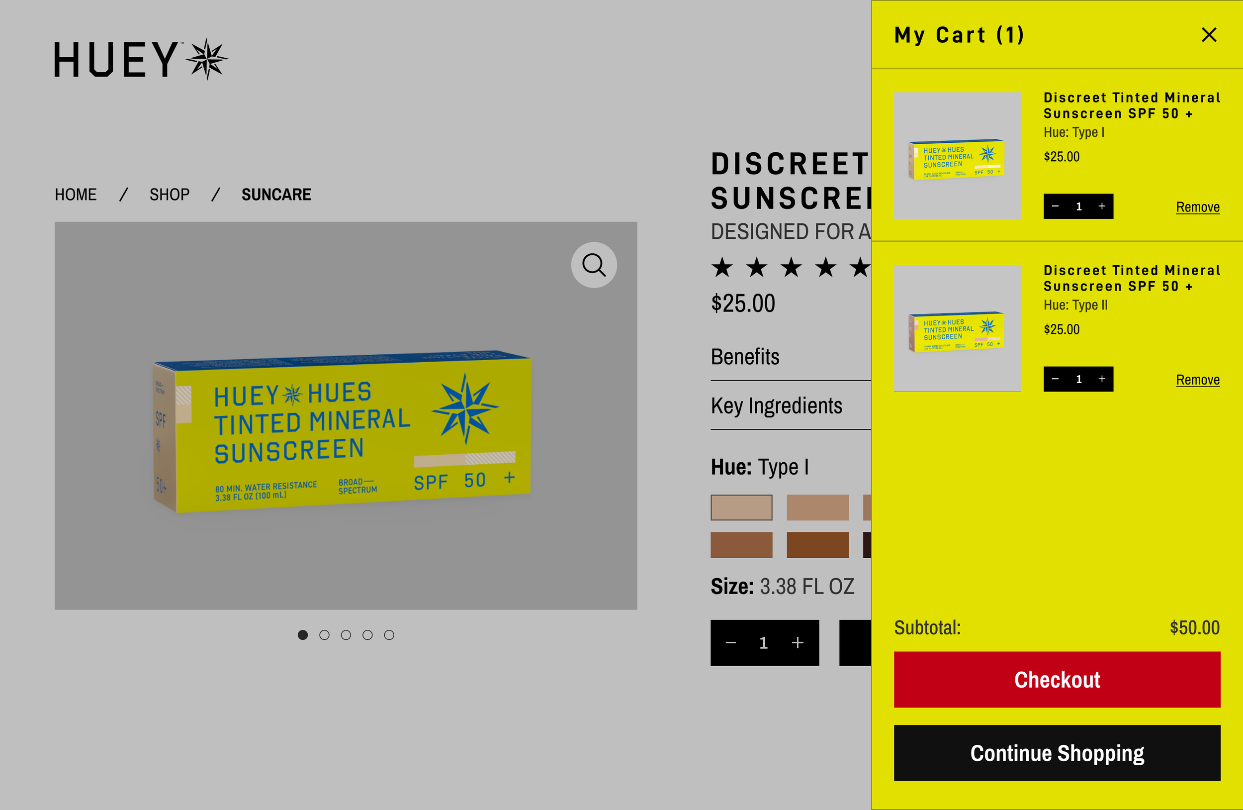
Cart drawer allows adding more of the same product or removing it entirely
Continue Shopping button lets users keep browsing
Product page is dimmed for contrast when the cart drawer is open
Checking Out
Homepage
Old

The current website lacks clear product information
The existing content feels directionless and sporadic
New
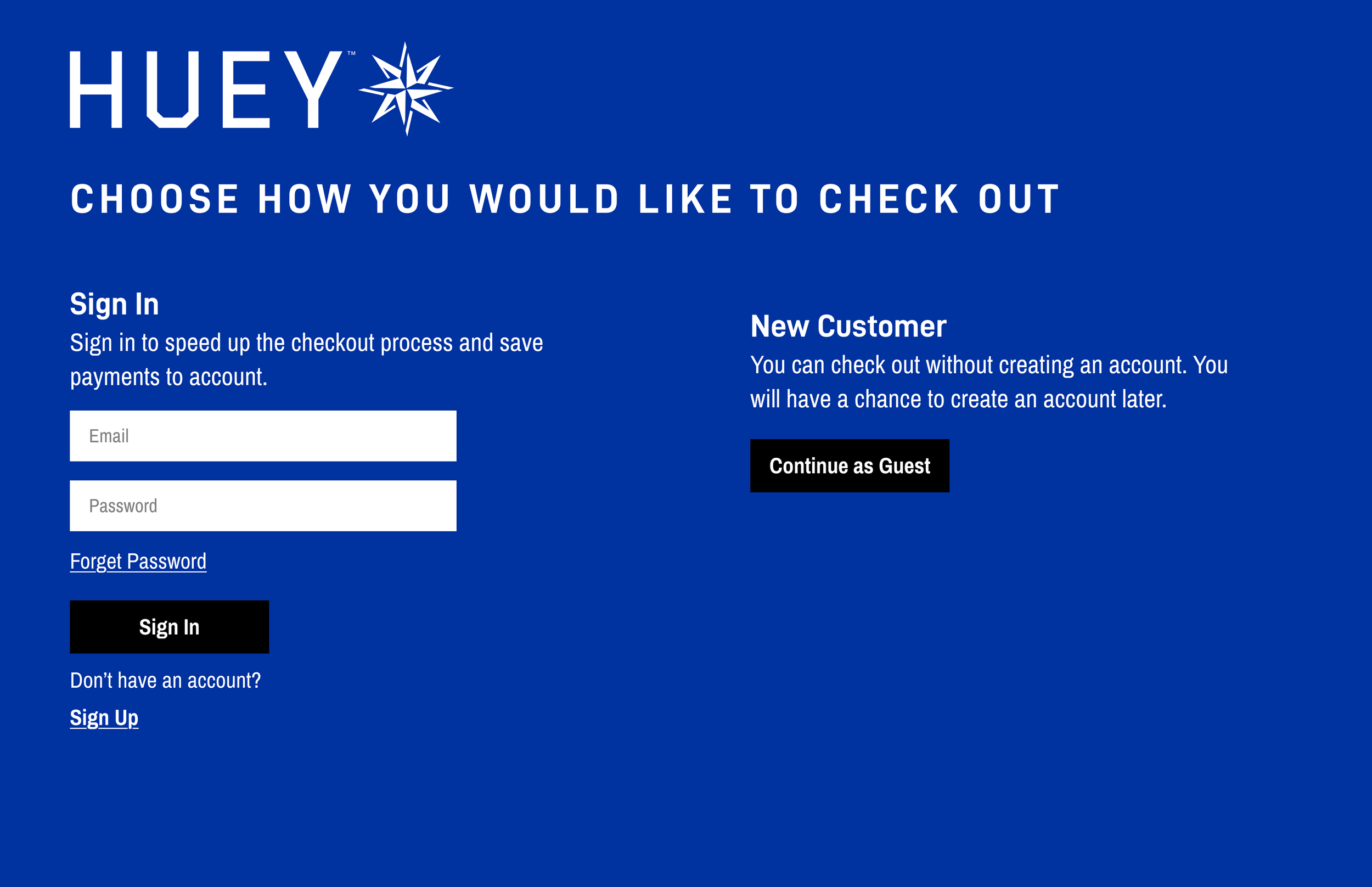
At checkout, users who aren’t signed in are prompted to choose between guest checkout or signing in
New

Since the client plans to use Shopify, it was designed to match their checkout screen
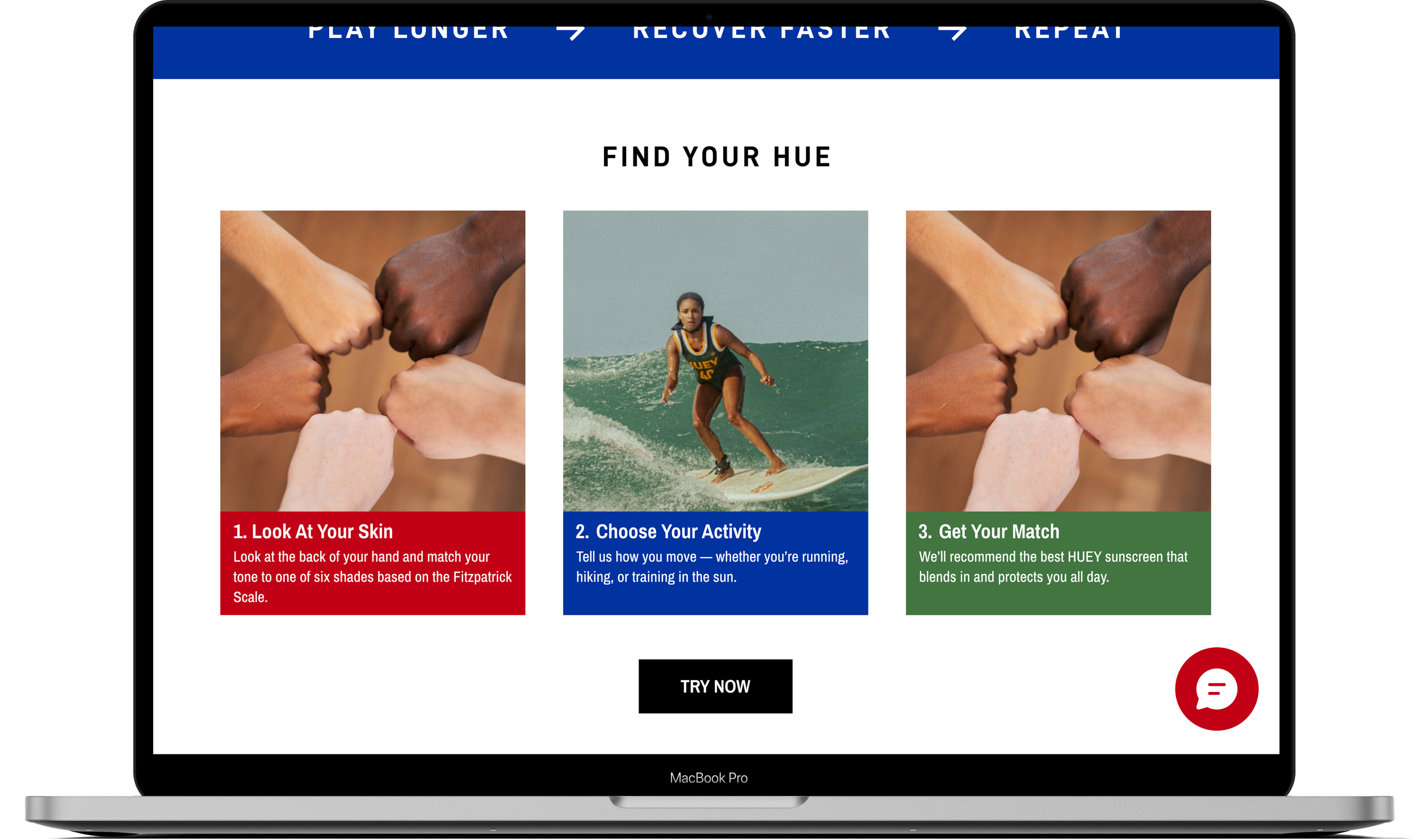
New

Home screen now highlights product previews, sunscreen guidance, and active ingredients
About section educates on sun fatigue and HUEY’s benefits
Final Screens


Try the prototype
We’re continuing to make improvements, so please let us know what could be better. Some pages and features may not be fully functional yet, as the prototype is still under active revision.
Target KPIs for Measuring Redesign Impact
Through this redesign, we aim to not only meet the client’s goals but also improve key KPIs, including:
Click-through rate (CTR) to the “Find Your Hue” sunscreen matching tool
Match completion rate – percentage of users who finish the quiz and view their product recommendations
Add-to-cart rate – percentage of visitors adding products to their cart after the redesign
Checkout completion rate – measures whether the improved UX reduces drop-off during checkout
Repeat purchase rate – percentage of customers returning to make additional purchases
Newsletter Sign-up Rate – The percentage of visitors who complete the newsletter sign-up form after visiting the site
Learning Outcomes
Learning Through Collaboration
This project was a refreshing change of pace, allowing me to collaborate closely with other designers to meet our client’s goals. At times, I wondered if I was contributing enough—particularly during the early project scope phase—but I made sure my input on the redesign’s design aspects was thoughtful, purposeful, and aimed at improving quality.
Future Testing & Iteration
Due to the short timeframe, we couldn’t conduct formal user testing during the redesign. We plan to test the final design with users afterward and refine it based on their feedback. In the meantime, the client’s feedback on the redesign served as an informal round of testing.
Full Website Redesign Experience
Unlike my recent projects that focused primarily on mobile apps, this redesign allowed me to dive into a full web platform. I enjoyed the shift in focus, and the process was smoother than I anticipated—though, as with any project, there’s always room for improvement.