NavARgate
Navigate together, every step of the way
NavARgate is an AR-powered mobile app that helps travelers confidently navigate complex transit hubs.
Built with empathy and intention, it is designed for today’s increasingly global and digitally connected world.
Timeline
Jan — May 2025
The Problem
Large airports and train stations can be disorienting, especially for unfamiliar, non-native, or accessibility-needing travelers.
Without real-time, personalized support, these moments often lead to unnecessary stress and anxiety.
Personalized Journeys:
Tailors routes based on booked flights, train details, and traveler-specific needs
Users input their travel information to receive:
Personalized step-by-step directions
Walking time estimates
Key checkpoints along the way
Integrated Transit Systems:
Combines airport and train station navigation into one seamless experience
Provides coverage across a vast network of airports and train stations worldwide
Real-Time Language Support:
Offers on-screen translations in the user’s preferred language
Removes the need to switch between external app
Theme 2: Guidance
Pain Point:
Participants felt unsure about what to do and where to go during check-in
Insight:
Clear, contextual guidance at key stages like check-in can reduce confusion
How Might We provide guidance for key stages like check-in?
Theme 4: Visual Clarity
Pain Point:
Participants found the size and layout of some airports to be overly complex
Insight:
Users benefit from a clear visual layout to reduce confusion in complex spaces
How Might We provide users visual clarity in high-stress environments?
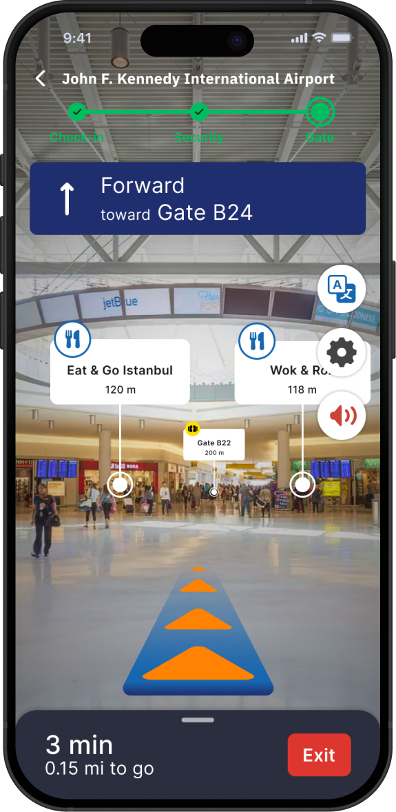
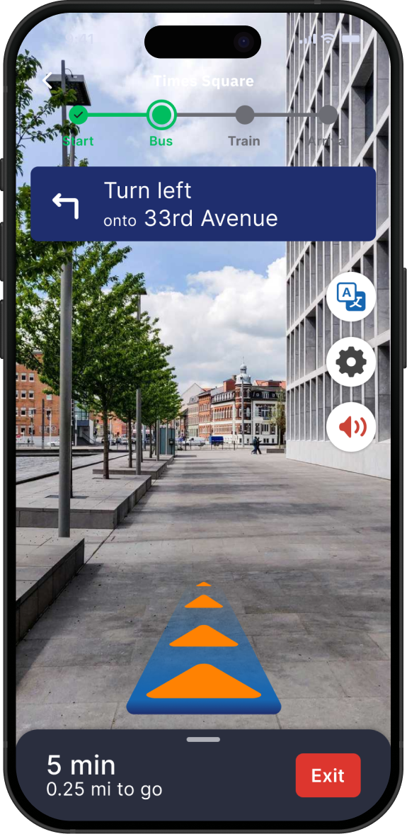
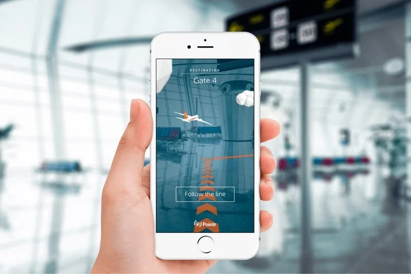
AR Guidance
Step-by-step AR overlay guides users to key areas using visual cues
Shows amenities like food joints and stores along the journey
Includes a progress bar at the top to assist less experienced travelers
Provides real-time translation by scanning signages with the camera
Displays directions with optional voiceovers for easier navigation
Various Language Options
Users can select from a variety of languages based on their needs
The app will automatically display in the selected language and can be changed at any time in the settings


A mockup of the notification screen to review the overall aesthetic.


Add flight became its own bottom tab and requires less steps to access the main screen and has supporting text for users.

Similar to “Add Trips,” navigating train stations now has its own bottom tab called “Transit Map” to align with its purpose. Static transit hub maps still exist in sections like Travel Guide and Flight Details, as they typically require deeper navigation through secondary screens.
A screen was designed to showcase the amenities menu—such as food spots and lounges—for users who wish to explore those areas.

Solution
What makes it unique?

Secondary Research
To challenge assumptions, explore unknown factors, and better understand the travel challenges users face in airports and train stations
Information Overload
A phenomenon that was identified as significant barrier in transit environments. Travelers often struggle to find the right information—leading to slower navigation and heightened stress. This underscores the importance of delivering only the necessary.
User Research
To gather qualitative insights on user pain points and support the development of HMW statements, which will guide the direction of solution ideation
Theme 1: Inexperienced
Pain Point:
“All of these things are stuff that you are not usually taught.” —Participant 1
Insight:
Design should support users without expecting prior knowledge
How Might We design for users with no prior experience?
Theme 3: Accessibility
Pain Point:
Participants experienced challenges related to language barriers or impairments such as dyslexia
Insight:
Translation and sound-based guidance are essential for users with language or accessibility challenges
How Might We design for users facing language or accessibility barriers?
Research Synthesis
To identify patterns, prioritize traveler needs, and turn raw insights into actionable themes that shaped the personas and design direction
Personas
From research and interviews, two key personas were identified:
User 1
Travel a few to many times a year
Has navigated airports or train stations solo
Encounters stress mainly in unfamiliar or new transit environment


User 2
Rarely travels, and usually with friends or family
Face challenges with language, technology, and possibly accessibility
Experiences high anxiety when traveling alone or navigating without support

Ideation
To generate a range of solutions—such as AR guidance, travel guides, and multilingual support—rooted in the specific needs travelers
Reducing Stress with Travel Guide
Provides comfort through notifications and alerts
Shares helpful travel tips before travel
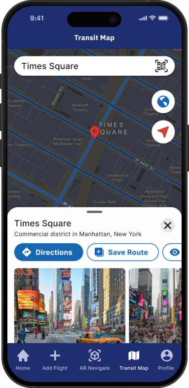
Maps for Transit Hubs
Dedicated screen for searching and viewing different airports and stations
Option to view either a static or interactive map
Ability to save maps for quick access later
User Flows
To map how travelers search, add, and navigate trips—prioritizing key interactions like AR guidance and personalized setup for a focused, accessible experience.
Exploring Early Red Routes
The main red route in my design is the Personalized Journey feature, which allows users to search and add their booked flights or transit details. Based on this information and their specific needs—including accessibility—the system generates a customized, step-by-step AR route to guide them to their destination.

Style Guide
Brand
The brand’s mission and vision are centered on fostering connection and empowering individuals through the shared experience of travel. This extends beyond travelers to include staff and service providers as integral parts of the journey. The brand is designed to evoke a sense of ease and inspire the freedom to travel without limits.
Color Palette
The color palette was carefully selected to convey inclusiveness, comfort, and trust.
Font Family

Chosen for its modern clarity and high legibility, this typeface combination ensures an accessible and professional reading experience across all screen sizes.

Graphical Elements

Usability Test
To evaluate how well users could navigate key red routes—such as adding a trip, searching a route, and starting AR navigation—identify usability issues, and gather feedback to inform design iterations
Iterations
Based on findings from usability tests, the design was iterated to create a more intuitive, user-friendly experience that prioritizes recognition over recall.
UI elements on the home screen—such as the trip cards and carousel—were enlarged to improve visual hierarchy and overall visibility.

A built-in travel guide within the app educates users on the travel process, required documents, airport information, and provides access to static maps for easier navigation.

Final Screens
Business Considerations
While the app’s success would initially rely on partnerships with airports and train stations, future collaborations could extend to airlines as well. I originally considered removing the check-in feature, since users typically handle that through airline apps. However, I chose to keep it as a forward-looking feature that could support potential airline sponsorships or integrations down the line.
Gamification
Interactive Mini-Game:
Users can engage with a fun step-by-step navigation mini-game while navigating transit hubs.
Collectible Rewards:
Visible coins can be collected along the route and redeemed for discounts at airport amenities.
Milestone Bonuses:
Bigger rewards are unlocked upon reaching key locations, such as security checkpoints or departure gates.
Business Benefits:
Higher Revenue:
Discounts and rewards drive more spending at airport shops, dining areas, and other services.
Stakeholder Engagement:
Businesses within the hub can sponsor or integrate into the gamified system, creating additional revenue streams and fostering partnerships.
Enhanced Customer Loyalty:
A memorable, enjoyable navigation experience encourages users to choose the same transit hubs or airlines for future trips.
Learning Outcomes
Researching and Testing with Accessibility Needs
Conducting user research and testing with the second persona group—individuals with accessibility needs—presented several challenges. Recruiting participants was difficult, as many were older adults facing language barriers and struggling with testing instructions. While their feedback was valuable, communication required extra care and patience. Testing a solution not available in their native language added further complexity. In the future, I aim to improve recruitment strategies and provide clearer support for better engagement.
Reflecting on User-Centered Design
While I initially questioned whether I could be considered an user myself, I realized my perspective was biased and not representative of the broader audience. At times during the design process, I created solutions that made sense to me but not to actual users. This experience reinforced the importance of staying grounded in the user's perspective, usability heuristics, and UI principles.
Technology in the Design Process
Throughout the design process, there were instances where I explored technology-driven solutions without fully knowing their technical feasibility. Although I researched examples of similar technologies in real-world use, the exact implementation for my solution remained uncertain. While it is common practice during early design to prioritize ideas over technical limitations, I found it important to remain mindful of feasibility, as it could help strengthen the practicality and future development of the solution.
Frequent User Testing
In future projects, I would incorporate more user testing throughout the design process—from early sketches to final screens. Gathering user perspectives earlier would help refine the solution through continuous feedback, testing, and iteration.
Future Implementations

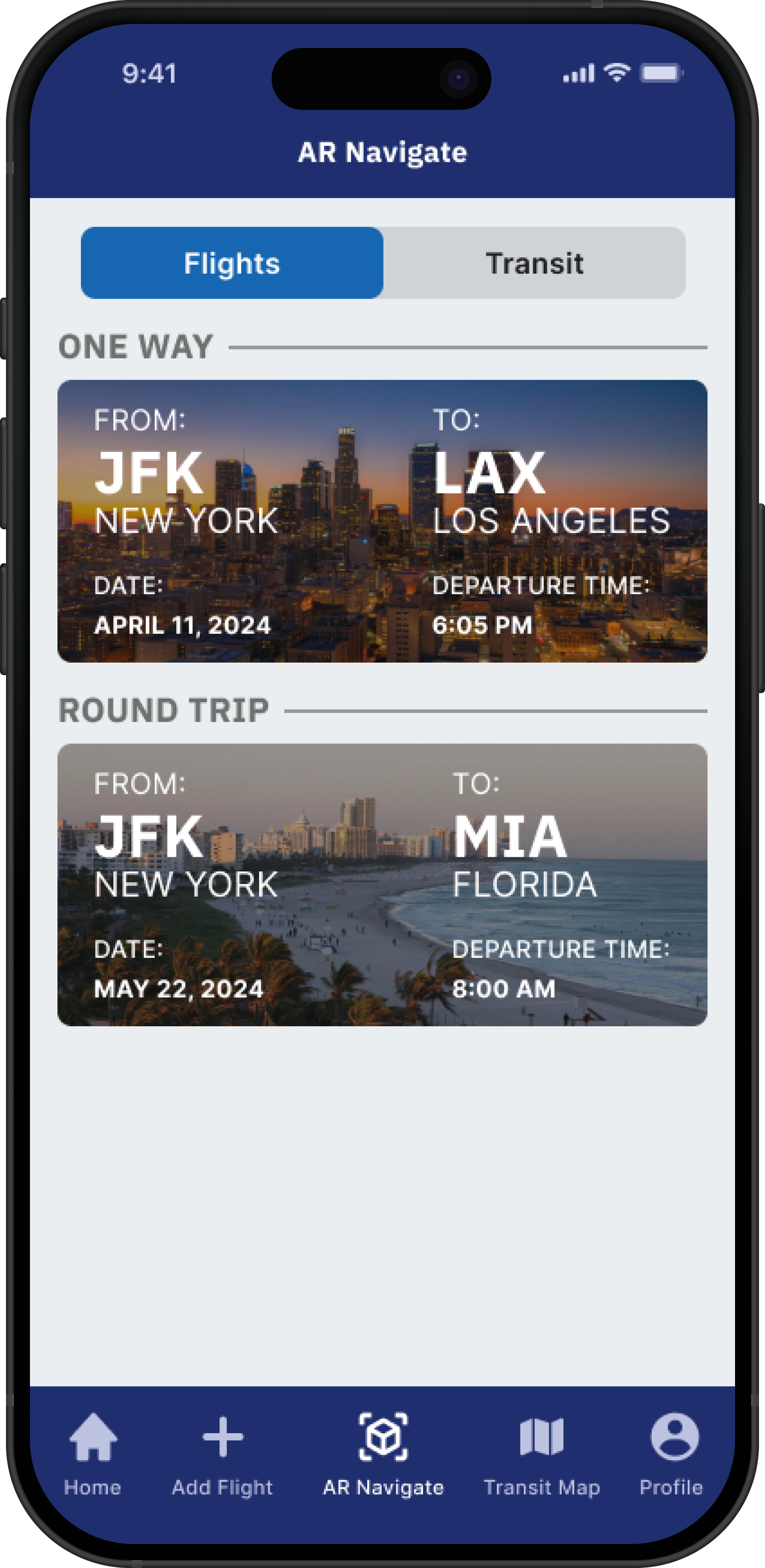
Users can now add and save multiple booked flights, making it easier to navigate round-trip and multi-city itineraries.

Try the prototype
For the best experience, we recommend trying it on your smartphone to simulate real app usage.
As noted earlier, round-trip bookings are now displayed as a single combined card—rather than separate outbound and return flights—to increase intuitiveness.

Users can slide the bottom sheet up or down to access the standard route display while navigating in AR, providing a clearer sense of control and closure.
Supporting the Post-Flight Experience
Currently, the app focuses solely on guiding travelers through checkpoints and to their departure gates. I’d like to expand the experience by also showcasing what happens after arrival—such as navigating to baggage claim, finding exits, or pickup zones.
Role
Springboard Project
UX Researcher
UX/UI Designer